Book Cover Art for The Voyage of the Dawn Treader
Amazon and HarperCollins have added the cover art for three of the The Voyage of the Dawn Treader movie tie-in books to their websites.
The Chronicles of Narnia Movie Tie-in Edition for The Voyage of the Dawn Treader (includes all seven stories in one book). Available for Pre-order here.

The Chronicles of Narnia Tie-in Edition for The Voyage of the Dawn Treader
The Voyage of the Dawn Treader Movie Tie-in Edition (Rack). This edition doesn’t appear to be available for pre-order yet. The cover art can be viewed on HarperCollins’ website here.

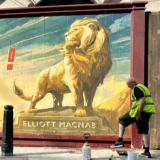
The Voyage of the Dawn Treader Rack Edition
The Voyage of the Dawn Treader Movie Tie-in Edition (Digest). Available for pre-order here. The cover art can be viewed on HarperCollins’ website here.

The Voyage of the Dawn Treader Digest Edition
All movie tie-in books for The Voyage of the Dawn Treader will be available in stores on Oct. 26, 2010. As the cover art becomes available, we will add them to our Merchandise gallery along with titles from The Lion, the Witch and the Wardrobe and Prince Caspian here.
Thanks to icarus for the heads-up!
The first one is gorgeous! The second, stately (I won't say boring) and the third….weird.
I agree, the first is excellent, the second is nice but that third is weird and "crowded"
really?. 1st eh not bad but over all nothing intriguing and not enough mystery. second very good captures the real main character of the story. and the third is the typical, everyone you expect to see. but gives a bit too much away.
I love it all you guys! And no one can change my mind about that! I just wish in the third they had done a better job of Caspian and Edmund. You have to admit that they are a little strange, considering how they did on the past two.
By the way, who likes that beard on Caspian? Makes him look a bit older and kinglier….I think.
Ditto, ditto, definitely agree!!! Yeah, that pretty much sums up what I was going to say, ~queenSUSAN~ and narnian1!!! Thanks for your comments. And sail on VDT!!!
Thank you Austra. 🙂 Actually, I believe I've changed my opinion about the second one. I love the fact that it's Aslan, he's my favorite character, and the poster is gorgeous. But I don't think it really reflects VDT in particular. For all the Chronicles, it would be magnificent. But VDT…I like the first one best. 🙂
I like all the covers,but we need more King Caspian,I'm just sayin'.
I agree wholeheartedly, it's Caspian's journey after all. I've always loved him in this book! 🙂
Oh please. I thought no one wanted so much of him.
i think the third one is sexy
Sexy? It looks almost as childish and crowded as the Prince Caspian DVD cover.
I like the first one the best. I hope they do something similar to that for the DVD cover. In my opinion, simple covers are the best, because when I'm trying to pick a movie to watch from my choice of movies I have, I rarely watch the movies with crowded covers, because the whole movie flashes before my eyes before I even watch the movie because of the cover.
The third looks like a movie poster. Love all three!
Oooh! I love the first one.The cover art for the last one looks like it could be movie poster art – the design seems strikingly similar to the poster concept art we saw a while back. But the Dawn Treader's sail is flipped…ugh. I really hope I'm wrong about it being a poster.
Oh, and one more thing – why do they have to have the cheesy "Return to Magic, Return to Adventure, Return to Narnia" phrases on all three? That's a slogan for the movie. These are books we're talking about. What's the point of having the slogan there for the all-seven-books volume? Nobody can "Return to Narnia" if they're reading the books for the first time… :-/
Well the third one looks exactly like the poster stand, except Peter, Susan, the Chief Dufflepud, Lilliandil, and the White Witch aren't included!!!
Well, you can return to Narnia with this book if you've read the first two already! 🙂
I wonder why they keep changing the middle part of the tagline. First it's "Return to Magic". Then it's "Return to Wonder". And now it's "Return to Adventure". At first I was thinking it was dumb to keep changing it…but now it's starting to grow on me. 😉 At least it makes things different each time. I wonder what'll be next?
I really had my heart set on having Lilliandil on the cover. And I would have named her Shamira, because the name means diamond and that is kind of like a star, right?
The composition of the third is the best yet, but still, the blending is sloppy. Just look at the way Lu's collar cuts into Edmund's head!
he noticed the same thing 🙂
The blending on the third one is terrible, which is a shame because that one showcases most of the characters. The first two are simple, yet wonderful!
The first one was expected. It is an absolutely beautiful shot, but it was expected.
The second one is an interesting choice. It has two pluses: Reep isn't on the logo; and "Return to Adventure" is better than "Return to Magic" (which appeared on the teaser poster).
As for the third, I was hoping to never see anything that even remotely looked like that banner ever again.
The link for second book cover is incorrect – it links to the page for the third book instead. But i have to say i love all 3! The third, with a bit more work, and bit of a tidy up around the rough edges, would make a fantastic final movie poster!
Fixed! Thank you. 🙂
"Ooh! Minotaurs, man. I love them Minotaurs. I think I'm gonna buy this book." (Days later …) "Awww, man! There weren't any Minotaurs in there. What happened? They just like stuck 'em on the cover picture?"
Seriously, I'm glad Minotaurs are in the film adaptation, just because they are indeed cool. 😀
Lol, yeah I hope no one buys the book hoping for Minotaurs! I really like them too, and I'm kind of glad they're in the movie. They're so big and hairy and cool! I can't wait to see them fight. 😛
I'm too much of a purist to be glad to see them in the movie… Besides, how would those hooves keep a grip on the deck? Do they roughen them? I mean, seriously! When you put cattle on wood you have to give them something for their hooves to grip, usually little protruding ridges for them to stand on (Cowgirl here knows from experience). With the boat rocking to and fro, how is it logically possible for them to not slide around? And also, of what use as a sailor is a minotaur? I can't imagine any, so does that mean Caspian brought them along as warriors? Wait, he was INTENDING on fighting?? Why bring them along "just in case" of a fight and feed them all that way?
All in all, I'm not happy. 🙁
HaHaHa That's hilarious!!! 🙂 @Lady Courage I didn't know they put little ridges on decks for cattle to stand on, neat! Makes sense the minatours weren't there in the book :/
lol Glad you enjoyed it! 😉 But it's true! I'd like to give whoever came up with that idea the job of loading cattle in a truck for just one day! Maybe they'd get it then… I hope I'm wrong and they've come up with a logical way around it. The minotaurs being there is bad enough, but I'll go crazy if they don't do something about the problem of hooves on wood. :-/
Aslan's mane they're all awesome!!!! =D
Awesome!! Looks great! Except the last one… What are those creatures that are not in the book doing on the cover??!! I don't like them being in the movie as it is, but putting them on the cover? Hmph.
That doesn't even look like Aslan.
The first one is the BEST.
Ditto.
WOW!!!!! the third is my favorite:P
EEEEEEE! AWESOME! PERFECTLY AWESOME… though Lucy looks kind of weird… is it just me, or does she look a bit off?
I agree, she looks disturbing to me, not at all flattering.
Yeah Pepper it is a weird picture of her! ;P
Ok, good it's not just me… maybe they enlarged her eyes? Don't look at me weird… they do it to models when they advertise shampoo or something. i saw the clip :/ anyways, those covers look *awesome*! 😀
Get a better look at Caspian and Edmund! I could have done better.
The first one is epic. And the sail is purple. 🙂
The second one is actually fine now that Reep has been removed from the logo.
The third one makes me raise an eyebrow. What the heck?
The third one does look odd… Kind of cartoonish, I think. Especially the minotaur. I hope they don't look like that in the movie…
Agree – the third one is too busy. They should remove some of the characters to clean it up.
I like the 3rd one!
Impressive! All of them are wonderful. Excellent job.
Oh my goodness they all look great!!! 😀 😀 😀
LLLLLLoooooooVVVeeeee the first, eh- for the second, and excited for the third. however, i dont care for the artstyle of the third as much as the poster for the first movie. it has kind of a blurry, aged effect that is kind of ugly, i think. the LWW poster had a dreamy, fantasy look that was more pleasant, i thought. not as much grey, and lucy looks kinda ugly on DT #3.
I like the third one best. I hope they're coming out with a Movie Companion soon. Anyone know anything about that?
The third one is weird. Does anyone notice that the second no longer says "Return to Magic"? But the first is beautiful! And the second is nice too.
The first one is great, and would, in my opinion, make a great movie poster.
I love the first one (expect for the "visit Narnia.com" which seems like it belongs on the back. . .). The second one is nice, I think I've just seen the image too often to have much of an opinion. =P The third one. . . 🙁
Also, what's the tagline for the film? We've had "Return to hope/ to magic/ to Narnia" then the second trailer had "Return to wonder" in place of magic, and now it's "adventure"? Interesting. . .
these are so beautiful! I am so happy! I think I want one…..
I'm just wondering, will there be VDT posters in stores in Canada later when the movie is out?
Hmm. That first one is good, the second one is… boring, and the third one would be AWESOME if the blending wasn't so sloppy! Seriously, did a monkey photoshop that? I can't have anyone ruining my Narnia!!
::breathes::
At least Peter, Susan, and the WW were taken out… the minotaur is bugging me, though. Looks fake.
Hee-hee, your comment gave me the mental image of a monkey doing Narnia photoshop…hee…I must be over-tired cuz now I can't stop laughing.
Truly, the monkey bit is making me laugh /my/ head off too!
(Sometimes I wonder just how many monkeys really do work on the sets … no offense to any worker in particular … I am just commenting on the adaption of the movies specifically.)
I Love all of them! But I really like the 3rd one most!
Oh! I love them!!
Look's great!!!
I like the first one the best. 🙂
Yay! The Dawn Treader has sailed from the bathtub!
To be precise, the Dawn Treader has sailed OUT of the bathtub!
I love the third one so much!! That's how I pictured the final poster to look, except I wanted Lilliandil on it too.
Yeah, that's what I think. I'm wondering why she's not on any of them.
wow the first one is beautiful, and the third one is lovely too.
I totally agree with almost everyone that the first is the best. We've seen the second from the teaser poster and the third comes from the posters in Cannes. What I don't get about the latter is why there is so much rays of shine coming from it.
First one's cool, second one is okay, and the third one I really like!
The third one!
The third one!!
The first one is the great. Simple, well composed, original and looks genuinely Narnian. The second is… there. The third one is AWFUL, looks like a very bad adaptation of the LWW poster, very poorly put together. The coloring is off, the composition is too busy. For their own box office sake, I hope they don't choose to go with THAT one. That one so ugly could scare kids and parents away from the theater. So I think we have a 'the good, the bad and the ugly' situation going on.
I Love the magestic look of the first one.
Kinda sick of seeing the picture on the second one.
I would have loved the third one if they would have merged them together.
Definitely agree. Yeah, that pretty much is what I think.
I really like the second one. Love the way you can see the DT in Aslan's eye – like he's watching over it:) Still think the first one works best with the book. And the third one is alright, but still too much.
Yeah, that's what I think!!!
i can't wait to see them on books!!!!!!
I LIKE ALL THREE POSTERS!!!!!!
Ahhhhhhhhhhhh. . . . I love it. . . .
My favorite one is the Dawn Treader. . .
Second the Aslan one. . .
Third the collage one. . .
Ther're all so coooooool. . .
I like the first two, the last one is okay, but I just hope they don't ruin the books, because they did that with Prince Caspain.
I think the first one is lovely,but I dont like that it includes all 7 of the chronicles. I think the second cover would be more appropriate for that purpose,and the first one would be good for just the VODT. I really like the first and second, and the third is pretty,but it looks more like a movie companion book. And why do they keep including the tagline when its never the same? I think "return to hope,return to adventure,return to Narnia' is alright,but if they're going to have to have a tagline I think it should be "Return to Magic Return to Adventure Return to Narnia" cause the hope part sounds kinda cheesy.
But back to the covers-I like them,but probably wont buy them
No way! i just saved those covers, they are AWESOME!
i love these
The third one looks like something some guy made in photo shop from that first huge banner we saw.
The cover art for the books look great. I especially like the first and third ones. Can someone explain what it means by rack and digest editions please?
"Rack" and "Digest" both refer to the size of the book. A "rack" sized book being a book of standardised size to fit into a conventional book rack slot at the book store. As for Digest size, i don't know where it gets its name from, but you can read about it here http://desktoppub.about.com/cs/paper/f/digest.htm or here http://en.wikipedia.org/wiki/Digest_size
The first one is brilliant! I think I'm gonna get that one.
but I need a new englisch edition of VDT, too.. Mine is very very used…
so I think, If I don't get an american pre 1994 soon enough I think I'll pre order the second one…
Wow – I love all three! i really like the third one – I like the detail. But I also love the other two – they're all amazing!
First is great, second is boring, third is crap.
The first one was very nice
The second one could be the cover for any Narnia book
ANd the third one was my favorite. I really liked it!
Eeeppp!! 😀 I love the 7-books-in-1 cover, with just the ship! It's gorgeous!! But, I will probably end up getting the digest one. I have this plan about getting my Narnia series as the movie tie-in editions, so, they better make ALL the movies!! 🙂
I like the first one, the 2nd one is a little bit to plain for me, and the 3rd one is so unrealistic.
I LOVE THEM! 😀 Although I don't like how Aslan looks now…it's weird O_o
The first looks totally awsome, the second looks okay, and the third looks just plain weird.
I like how the first one's a bit majestic, the second is, I agree, a little odd, and the third reminds of a sad star wars poster. Don't get me wrong I love the characters, but it's a bit much.