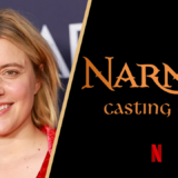
Early Look at New ‘Narnia’ Logo Revealed on Set

One of the lingering questions surrounding Greta Gerwig’s upcoming adaptation of The Magician’s Nephew has been whether the production would retain the Narnia logo introduced during the Walden Media era, which has been used consistently for nearly two decades.
Based on a new photo from a source on set earlier this year at Cardington Studios, it now appears we may have our answer.
The logo features a stylized serif font with gently curved, storybook-inspired letterforms. It appears notably simpler than the Walden-era design, favouring a flatter and more minimal look.
It is worth noting that on-set logos are often temporary and do not always reflect the final marketing design, but they can offer an early sense of the logo’s overall style and design direction.
This would not be the first time a Narnia film has used different logo variations during production. Before the Walden-era design became the franchise’s default (even extending beyond the films to book covers, official websites, and other licensed material), an earlier version appeared in the opening credits of The Lion, the Witch and the Wardrobe and an even earlier design featured in newspaper ads.
What are your first impressions of the logo? Let us know in the comments below!
I really enjoyed it!
I don’t know about anyone else, but I really dig this logo.
If there was a common criticism from the Narnia fan-base of the Walden films as a whole, it was that they were too serious, portentous, and aiming for an “epic” scope more in line with The Lord of the Rings than of Narnia… and I think the Walden-era logo is really indicative of that direction with it’s overly ostentatious and ornate lettering.
This by contrast feels cleaner, simpler, and a lot more playful and whimsical in tone. It reminds me much more of the book covers from the 70s that I had growing up in the 80s, and really gives me a positive sense that we aren’t just going to be seeing Walden 2.0, but maybe something that captures a bit more of that random, non-schematic, and whimsical nature of the books.
I don’t like this logo, I’m sorry
Nothing wrong with it like at all
NOT MUCH BUT I’LL TAKE IT!!
Im hoping it looks better in a more clearer image, as I feel the bubbliness of the font is too childish.
Just 220 days to go until all is revealed!
I liked it.
I’m not a fan of the logo. It looks too basic and childish! I really hope that’s not the final version.
Nothing wrong with the logo we’re just have to get used to it
Its giving 80’s fantasy font… I’m willing to bet money that the majority of the Gerwig Narnia universe will take place in the 80s.
I like it! Great starting point 🙂
If the film is good it will grow on me I feel but if it’s bad then mostly likely feel sad looking at it.
Yes, its definitely growing on me the more I look at it!
Gross. Do better.
Walden logo is GOATED
The longer I look at it, the more I like it!
As long as the movie remains true to the book, let the logo be whatever it will be.
It’s interesting that, judging by these comments, people have strong feelings about this new logo, some positive and some negative. All I have to say is that it would have been needlessly confusing to use the logo from the Walden Media series and this new one looks perfectly fine.
Looks very 90s, I’ll take it
I can see this logo doing well. The shaping of the letters and how they form the overall word is aesthetically satisfying, and it’s bold enough that I can see it catching people’s eyes. I think the final coloring will certainly make a difference, but I can get behind it (even if I still prefer the Walden-era logo for nostalgic reasons… but I assumed we’d get a new one).
The Logo is giving The Lord of Rings and Hobbit vibes in addition to the simplicity of the name of the title ( for now as they might change it after the film is released to the public). Well done, let the count down begin.