HarperCollins Searching for a Graphic Designer to Rebrand Narnia
HarperCollins is looking for “an emerging graphic designer to create a new brand identity for one of the most iconic and best-selling book series of our time – The Chronicles of Narnia.” This includes a new logo, font, and color scheme that will be featured on books, social media, products, etc.
The deadline to submit a concept is December 10. The winner will be announced in January. Learn more.


Hmm. Interesting. I like the idea of the books having a different logo/font from the movies. (I don’t dislike the movies’ logo at all. It’s just that the movies and the books are different things with different continuities.) But I don’t have any particular image in my head of what a Narnian brand identity should look like. That’s why I’m not a graphic designer, I guess.
The link given on this page isn’t working for me (it’s something to do with Facebook, but I don’t have a Facebook account). Is it meant to be this article? https://www.lbbonline.com/news/dad-shots-brief-asks-young-creatives-to-rebrand-chronicles-of-narnia
Link fixed, thanks!
Hi Glumpuddle,
I’m still not sure it’s the right link — it now goes to a page for “New Blood Awards” with several different organisations involved, but none of them seem to be HarperCollins and Narnia. Is there a page specifically for the HarperCollins offer?
I have a number of ways I would design Narnian logos, but I unfortunately due to my circumstances had to major in healthcare rather than art, so I don’t know if I could be hired for this job as it says it is only for new grads.
I feel the need to point out that such a contest means they’re going to get a whole bunch of material for free. They’ll have gobs of ideas to look through for which they didn’t have to hire professional artists. It is also worth noting that if you win, it doesn’t mean that it will definitely get used. It *might* get used, in which case you get extra money, of course. See the FAQ page. (I also spotted an apostrophe there that doesn’t belong, in case anyone cares, ha.) That all being said, it sounds like a reasonably good opportunity for an artist looking for employment to get “a foot in the door”. However, read the fine print, please, if you’re planning on giving it a go. That’s my two cents, anyway! I didn’t check, but sometimes contests claim ownership to your submitted artistic material so much that they could potentially repurpose it for anything they want without paying you a cent or giving you any credit.
Wise advice, Mrs. Beaver, wise advice.
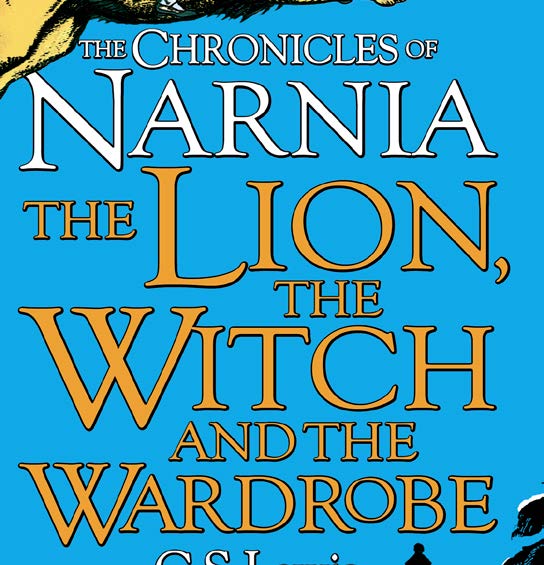
This has been a frustration of mine, so I’m glad they are trying to give the books a “face lift”. The graphic design of most of the copies of the Chronicles of Narnia look too old or cheaply made in comparison with contemporary children’s books. If I didn’t know what Narnia was, I probably would not pick up the book or series based off of the cheap looking covers. So I’m glad that they are rethinking their strategy.
Glad they’re looking into changing things up! Though I love the original books, the covers of certain editions don’t give off a good first impression. Not much of a graphic designer myself sadly, but good luck to all Narnia fans who participate!
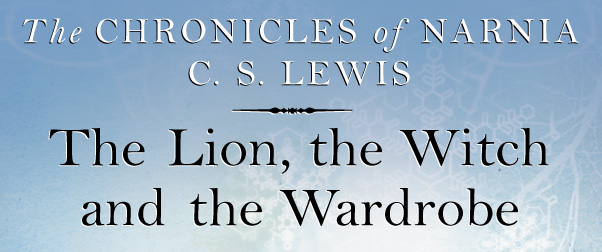
I agree. I’ll never forget the first time I picked up The Magician’s Nephew (one of my favorites in the series); it was the version with Digory floating in the air, with Polly floating up below him and the Witch grabbing her hair. I remember thinking to myself, “is that Lucy? And who’s the princess? And why is that kid up in the trees?” I suppose it’s not a bad reaction – a book’s cover should make readers check it out – but my first impression was one of confusion. That was the same brand of books that called the Lady of the Green Kirtle “the Emerald Witch” (a title I don’t think she was ever given in the books) and it was just… weird. Since then I’ve seen many other (and IMO better) covers for that book – the one of the kids riding Fledge, the one of the Witch sitting in the Hall of Images, and (my personal favorite, the one I went on to own later) the one of Digory in the garden, staring up at the tree full of silver apples. They were all pretty cool, coming from the perspective of a die-hard fan, but in a time when everything is so super-realistic-looking they’re not what I’d call top-notch art. But then again who am I to criticize? I can do 8-bit pixel art, and doodle with a pen, and that’s about it. 🙂
I’m a freelance artist of 10+ years experience. NOBODY do this!
This is Spec Work.
https://www.youtube.com/watch?v=DsstOs-K7gk
Spec Work is a highly unethical and exploitative practice that disguises unpaid labor as “a contest” when you should be compensating these professionals for their efforts. This targets young, naive, and desperate people who don’t have the finances to defend themselves when their work gets stolen and used “with just a few minor changes.”
Harper Collins is by no means a small publisher, they have the capital. How cheap do they think logo design really is? Seeing them engage in scummy Spec Work campaigns is just so shameful and insulting. Nobody should participate; your participation only perpetuates such exploitation of freelance artists, it encourages this borderline-criminal behavior.
This isn’t a contest. This is spec work.
Nobody should encourage this kind of “contest” by participating. This is exploitation of freelance artists.
I did not know the term “speculative work” until you referenced it (but shared related concerns in a previous comment); thanks for the new vocabulary!