The Chronicles of Narnia Mass Market Paperback Editions Get a Fresh Look for 2025
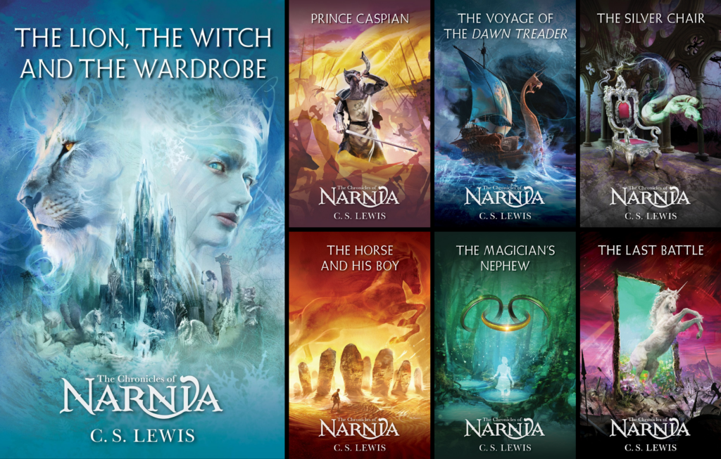
The mass market paperback editions of The Chronicles of Narnia have received a fresh new update for 2025!
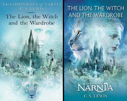
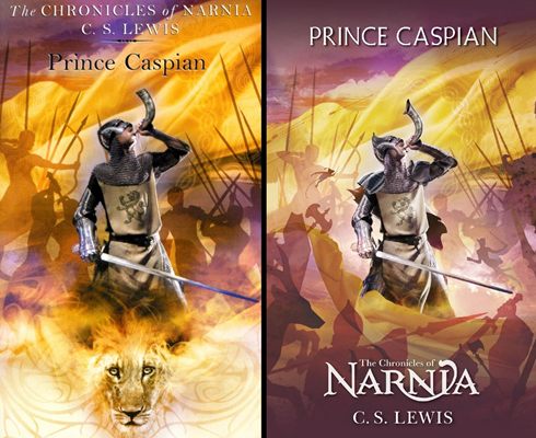
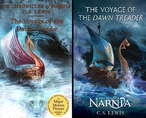
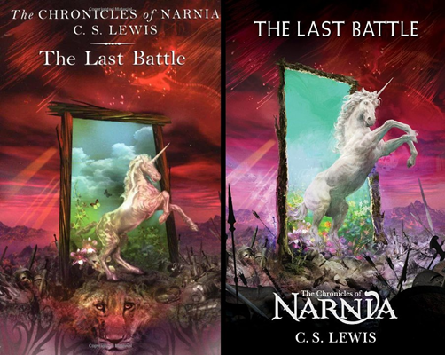
Released on April 15th, these new designs feature art by Cliff Nielsen, who designed the cover art for the mass market paperback editions released in 2002 (see comparison below) as well as the 7-in-1 deluxe editions published in 2004 and 2025.
Some of the new covers borrow elements from the 2002 editions, with Prince Caspian most closely mirroring the original design, while The Voyage of the Dawn Treader and The Magician’s Nephew appear to be complete redesigns inspired by Nielsen’s original covers.
These mass market editions also feature black and white illustrations by Pauline Baynes, the original illustrator of The Chronicles of Narnia.
What do you think of these new redesigns? Share your thoughts in the comments!


Even though these were never the best cover sets to start with, the modifications are mostly alright – slightly stronger colour intensity all round, and some sharper visuals for some of the graphics (for better or worse in some instances).
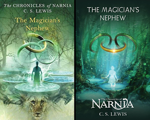
The clear winner here is appropriately enough The Magician’s Nephew, where the figure now looks recognisably like Polly, rather than a generic silhouetted man crackling with electricity for some reason.
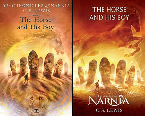
By contrast, The Horse and His Boy is probably the biggest loser – the new horse graphic just looks all wrong.
These covers must have sold really well. Hence issuing refreshed versions, and also the new set clearly drawing influence from them.
Of the refresh covers, I think MN is the only improvement.
I think the changes are big improvements. The original versions of these covers had a very dreamlike feel which would be great if they were covers for Alice’s Adventures in Wonderland or Through the Looking Glass and What Alice Found There, but they never really felt right for Narnia to me.
I wonder if the character rising from the pool on The Magician’s Nephew was always supposed to be Polly or if they changed that. I always assumed it was Digory. If it was always meant to be Polly, I think that says something about those covers.
I am looking at these on my budget level phone, so my opinion might change later. But I don’t really like these covers. The reason is, they look a bit all over the place. Maybe that’s because they are side by side with the old ones, and the angles are different. The only one that “pops” for me, is Magician’s Nephew. Although the new angle of the rings reminds me of Mickey Mouse! Laughing here. But I really need to go on my more hi def monitor to get a better impression.
Why is it so hard for HarperCollins to commission decent cover art for Narnia?! No one has yet cracked it, have they. Those originals were over 20 years old, and yes I bought them as a young teenager but that style was very much of the time. The refreshed versions are an improvement, but now in the age of AI imagery they still look cheap and dated in my view. Mercifully, the UK paperbacks are a tad more tasteful albeit lacking imagination. Bizarre.
I think all the new covers are an improvement except Prince Caspian and The Voyage of the Dawn Treader. I like the old PC cover better because there is no weird spike on Caspian’s helmet and the Lion blazing beneath his feet looks great. The old VDT didn’t really seem to NEED an improvement except to get rid of the strange man’s face floating in the water. But on the whole, the new covers look pretty cool!
@Noelle Torgerson, I never noticed that strange man’s face in the VDT cover before. Weird!
Are we just done with paying real artists to draw and paint something beautiful with their hands? These covers and their original iterations seem like chaotic photoshops. They’re messy and artificial.
Forrest, I agree that physical paintings would be beautiful covers. So much art is digital now that physical paintings would stand out.
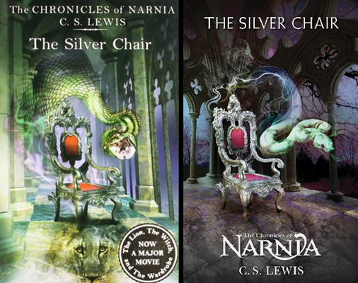
The benefit of these revised covers is that it is easier to read the titles, which is important on digital markets like Hoopla where the covers are much smaller than in real life. I do like Bree’s new position jumping over the sun. This new revision softens some of the strangeness of the old covers such as with the person coming out of the pool, LotGK in snake form, and Jewel’s unusual appearance in LB. This might be a good thing or a bad thing depending on the perspective.
I did notice they removed Aslan from the base of the covers and also changed the position of the rings on the MN cover so they look less like a trinitarian window design. I like the rings better the old way, but I’m glad to hear that Harper Collins is making another printing.
I’m a little torn. I think I like these. I’d say Wardrobe, Caspian, and Magician’s Nephew (should be Digory, though) are all improvements; VDT is too, they just lost the purple sail. Last Battle is just ok. I think I like the old SC better. HHB is slightly better, but Bree’s head is lost in the upper corner. I would have liked the whole body to be moved lower. I actually like that they don’t all have Aslan on the front anymore. The covers are very busy and detailed, and having the lion underneath is a little too much now that I can see the comparison.
They’re not my favorite, but I’d buy them if they’re numbered in published order. The images are in published order, so I’m curious.
@Anfinwen, yeah, I agree they look better without the Aslan logo (or whatever it was supposed to be) at the bottom.
Are these the unabridged editions? I would love to own the complete set.
Love Narina books in there lovely new look and were can I buy the books from
The old designs are so much better. I like how Aslan is featured on all of them, it has more of a fantasy feel, and I love how Diggory is on the Magicians Neohew in the original one. I don’t like they changed it to Polly. Also too, the snake is much more realistic on the Silver Chair cover of the old one, unlike the newer one. And finally, what’s with the spike on Prince Caspians helmet in the new P.C.? I can go on and on about every single one tbh. All 7 old designs are just more detailed, better
better, and how I imagined it. Not the new.
I don’t like either versions. The only newer ones that look slightly better would be LWW and MN. I also find the font extremely boring on the new designs.
As weird as they are, my favorite covers (and this might just be nostalgia speaking) would be the ones from the ’70s.
I like the old covers better and how Aslan’s face was always part of the covers in every book. Made it more enchanting and dreamlike.
I hope they don’t change the synopsis at the back of these old editions because the way those were phrased felt so magical
Not a fan of these updated designs…
@James Anthony Huber, I am 99% sure that these are unabridged. I assume Narniaweb would have mentioned it, if it was reported that they were abridged. Because that would be huge news. The only abridged versions of the Narnia books have not been presented as novels. (They have been picture books, old graphic novel.)
Golden chair
Do they have the Paulin Baynes illustrations inside?